

Correlation analysis between variables can be easily analyzed used Matrix scatter plot, Correlation coefficients, Correlation Heatmap, etc.
The previous several articles have talked about different methods to read data from GitHub and from Google Drive, and how to clean the dataset through missing values detection and missing values imputation, outlier detection and treatment. Finally, we obtained a cleaned dataset, which was saved with name gdp_china_outlier_treated.csv into the local working directory. I suggest you reading these articles from the beginning in order to better understand the data cleaning process.
This article will display some essential methods to make a correlation analysis and visualize the correlations of multiple variables with Python packages. Correlation analysis is a bivariate analysis, which measures the strength of association between two variables and the direction of the relationship. Correction analysis between multiple variables plays an essential role in data analysis and modelling. The main benefit of correlation analysis is that it helps us determine which variables are import and need to further investigate.
I will use the final cleaned dataset gdp_china_outlier_treated.csv, which can be downloaded or directly read from my GitHub repository. You can read this article, How to Read Dataset from GitHub and Save it using Pandas.
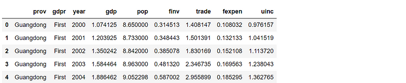
Now, let’s read the dataset into Pandas’ DataFrame as follows.
# import required packages
import pandas as pd
import matplotlib.pyplot as plt
import seaborn as sns

# read data
df = pd.read_csv('./data/gdp_china_outlier_treated.csv')

# display the first 5 rows
df.head()
1. Matrix scatterplot method
Matrix scatterplot between multiple variables is a great and fast way to roughly determine if there is a linear correlation between multiple variables. We use Python Seaborn’s pairplot()function to make the matrix scatterplot.
(1) Matrix scatter plot with regression lines for the variables in general
# matrix scatterplot with regression lines
plt.figure(figsize=(15,7))

matrix_scatter = sns.pairplot(data=df,kind='reg',
                             plot_kws={'line_kws':{'color':'red','lw':0.5}})
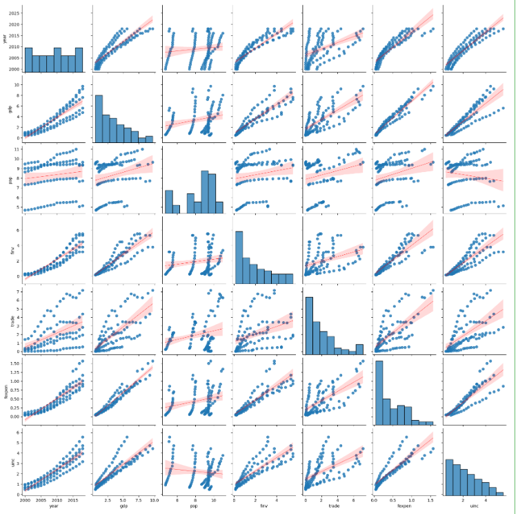
From the above matrix scatter plot, we can see the degrees of correlations between two variables. The purpose of this article is to display the methods of correlation analysis rather than to analyzing correlations pair by pair in details. Let’s just see the first row, i.e. correlations between year and anyone of the other variables, for example.
The results show that year has higher a positive correlation with gdp, finv, fexpen and uinx, separately. Whereas, it has a weaker positive correlation with trade, and has a very weak positive correlation with pop. However, to estimate how high and week needs to calculate the correlation coefficients.
(2) Matrix scatterplot with regression lines for variable of each province
plt.figure(figsize=(15,7))

matrix_scatter = sns.pairplot(data=df,hue='prov',kind='reg',
                             plot_kws={'line_kws':{'color':'black','lw':0.1}})
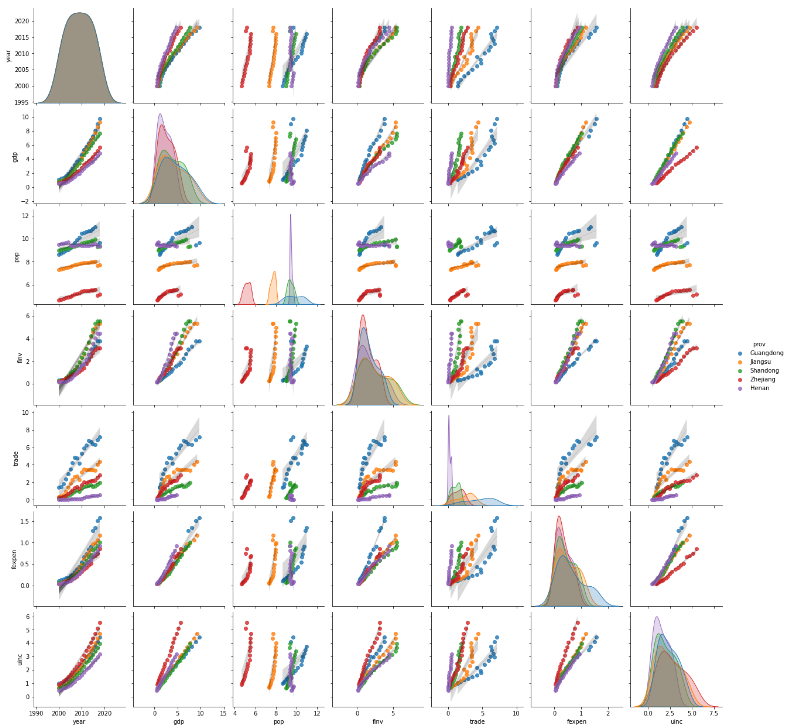
From the above results, we can conclude that the correlations between the variables in each province itself display comparatively much stronger than these variables as whole. In this connection, the provinces should be encoded as dummy variables if we develop a statistic linear regression model.
2. Method of correlation coefficients
Pearson correlation is the standard and main type of method in the correlation analysis, and Pearson’s correlation coefficients are widely used to identify the degree of the linear relationship between two variables.
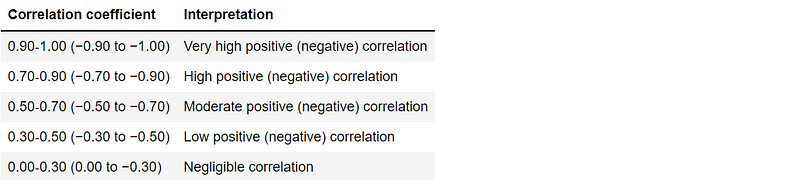
(1) Interpretation of correlation coefficients
(2) Pandas’ correlation method
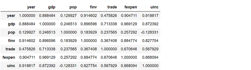
Pandas dataframe.corr() is used to find the pairwise correlation of all columns in the DataFrame. Any na values are automatically excluded, and any non-numeric data type columns in the DataFrame are ignored. Pearson correlation is the default method in Pandas.
corr = df.corr()
corr
method ='pearson': standard correlation coefficient, default methodmethod ='kendall': Kendall Tau rank correlation coefficientmethod ='spearman': Spearman rank correlation coefficient
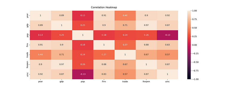
From the above matrix and the below heatmap of the correlation coefficients, we can clearly identify the degree of the linear relationship between two variables in details.
3. Method of correlation heatmap
We can use Seaborn’s heatmap()function to visualize the correlation coefficients.
(1) generate correlation heatmap
# The size of the heatmap.
plt.figure(figsize=(16,6))

# Store heatmap object in a variable to easily access it
# Set the range of values to be displayed on the colormap from -1 to 1, and
# set the annotation to True to display the correlation values on the heatmap.
heatmap = sns.heatmap(corr,vmin=-1,vmax=1,annot=True)

# Give a title to the heatmap.
# Pad defines the distance of the title from the top of the heatmap.
heatmap.set_title('Correlation Heatmap',fontdict={'fontsize':12},pad=12)
(2) save the heatmap
plt.savefig() method cannot save Seaborn’s heatmap correctly, although there is no error. We should use the following method instead.
figure = heatmap.get_figure()
figure.savefig('./results/heatmap.png',dpi=300)
4. Online course
If you are interested in learning data analysis in details, you are welcome to enroll one of my course:
Master Python Data Analysis and Modelling Essentials