

Model Evaluation makes a model more reliable
Part I: Model Estimation
Part II: Model Diagnostics
Part III: Model Improvement
Part IV: Model Evaluation
In the previous post, we have estimated a model, and then diagnosed the problems of the model, and finally obtained the improved the model. In this post, we will investigate the performances of the model through model evaluation. Model evaluation denotes the general process to assess the performance of a model, whether it is good or bad to present the dateset, with different evaluation indices or metrics. In general, it includes the evaluation of the model fitting, model validation and model testing. In our example, or for a classic regression model, the model validation and model testing mean similar thing, which refer to prediction performance test of the model to new dataset, i.e. testing data.
1. Evaluation of Model Fitting
It is very handy to use statsmodels.regression.linear_model.OLS.predict to display the model fitting values and model prediction values. Our final improved model was developed by dropping several regressors from the X_train dataset, i.e. X_train_drop dataset.
y_fit = res.predict(X_train_drop)
The OSL regression results have already showed us numerous statistic matrices, such as R², ????????????. R². We can display them separately here.
print("R-squared: ",res.rsquared)
print("Adj. R-squared: ",res.rsquared_adj) 
Besides, we use some other metrices, Mean Absolute Error(MAE), Mean Squared Error (MSE), Root Mean Squared Error(RMSE) and Mean Absolute Percentage Error(MAPE) to assess the model fitting and model prediction performances.
Statsmodels has several built-in functions to calculate most of these metrics in its statsmodels.tools.eval_measures module. Unfortunately, we have to calculate `MAPE` ourselves because it is not included in Statsmodels.
from statsmodels.tools.eval_measures import meanabs,mse,rmse
import numpy as np

print("mean_absolute_error(MAE): ", meanabs(y_train, y_fit))
print("mean_squared_error(MSE)",mse(y_train, y_fit))
print("root_mean_squared_error(RMSE)",rmse(y_train, y_fit))
print ("mean_absolute_percentage_error(MAPE): ",np.mean((abs(y_train-y_fit))/y_train))
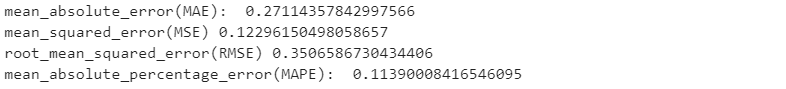
From all the above results, we can conclude that the model has a good performance to fit the training data.
2. Evaluation of Model Prediction
Let’s evaluate the model forecasting ability on testing dataset.
First, we predict the testing target, i.e. y_test.
X_test_drop = X_test.drop(['pop','prov_gd','year','fexpen','uinc'],axis=1)

X_test_drop = sm.add_constant(X_test_drop)

y_pred = res.predict(X_test_drop)
Then, we calculate MAE, MSE, RMSE and MAPE of the testing.
print("mean_absolute_error(MAE): ", meanabs(y_test,y_pred))
print("mean_squared_error(MSE): ", mse(y_test,y_pred))
print("root_mean_squared_error(RMSE): ",rmse(y_test,y_pred))
print ("mean_absolute_percentage_error(MAPE): ",np.mean((abs(y_test-y_pred))/y_test))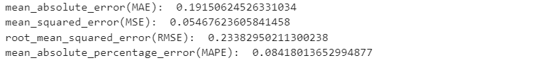
The testing results above shows that the model has very good prediction performance. The MAPE is only 8.4%.
3. Comparing Prediction Results
Next, let’s display the statistic metrics in Pandas’ DataFrame.
actual_pred_compare = pd.DataFrame({'Acutal values':y_test,
'Predicted values':y_pred,
'Errors':y_test-y_pred,
'MAE':meanabs(y_test,y_pred),
'MSE':mse(y_test,y_pred),
'RMSE':rmse(y_test,y_pred),
'MAPE':np.mean((abs(y_test-y_pred))/y_test)})
actual_pred_compare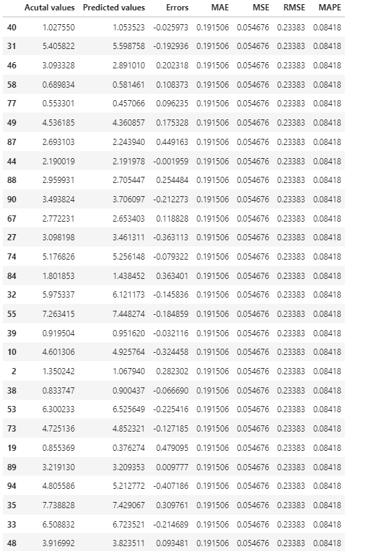
4. Model Results Visualization
Visualizing the model results can help use easily to assess how the model performance.
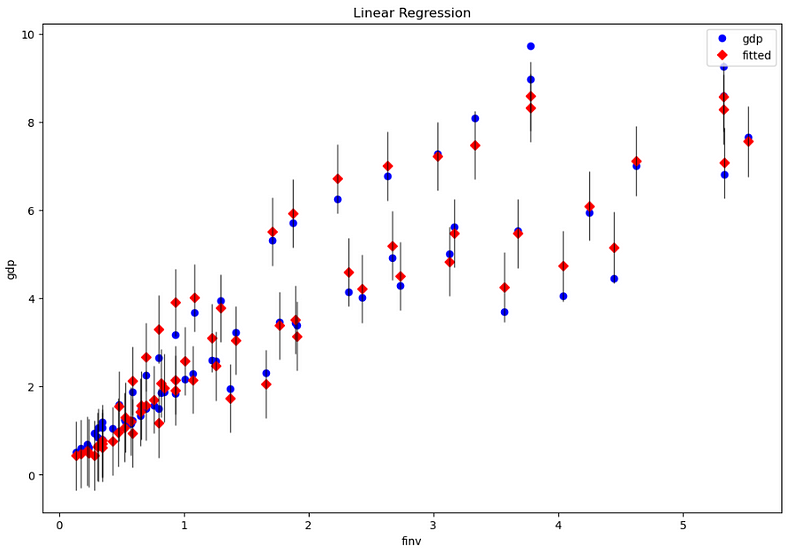
(1) Visualize the fitting results
In the statsmodels, it provides some beautiful plots. First, let’s plot gdp observation data, fitted value and residual (error) bar.
import matplotlib.pyplot as plt

fig, ax = plt.subplots(figsize=(12, 8))
fig = sm.graphics.plot_fit(res, 1, ax=ax) # or use the variable name, such as 'finv'
ax.set_ylabel('gdp')
ax.set_xlabel('finv')
ax.set_title("Linear Regression")
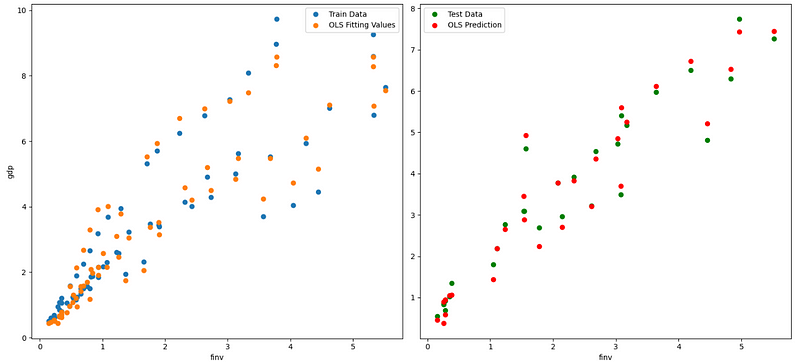
(2) Visualize the fitting and testing results
Now, we plot dependent variable vs. independent variables in terms of observations, fitting, and prediction values. Due to multiple independent variables, we can only plot one pairs per time in a 2D plotting system, suh as plotting gdp vs. finv, for example as follows.
fig, axes = plt.subplots(1,2,figsize=(15,7))

axes[0].plot(X_train_drop.finv, y_train, "o", label="Train Data")
axes[0].plot(X_train_drop.finv, y_fit, "o", label="OLS Fitting Values")
axes[0].set_ylabel('gdp')
axes[0].set_xlabel('finv')
axes[0].legend(loc="best")

axes[1].plot(X_test_drop.finv, y_test,"go", label="Test Data")
axes[1].plot(X_test_drop.finv, y_pred,"ro", label="OLS Prediction")
axes[1].set_xlabel('finv')
axes[1].legend(loc="best")

plt.tight_layout()
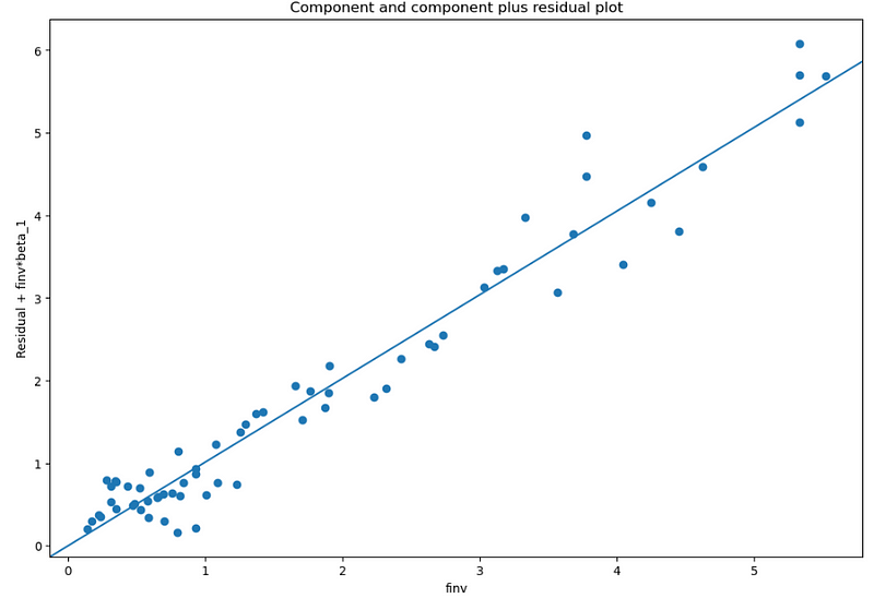
In the third example, we plot finv vs. finv + Residual.
fig, ax = plt.subplots(figsize=(12, 8))
fig = sm.graphics.plot_ccpr(res, “finv”, ax=ax)