

Data Visualization with Matplotlib Object-oriented Interface us easier complicated plots
In the previous article, the MATLAB-style Interface has been discussed. The Matlab-style interface is fast and convenient for simple plots, while it is easy to run into problems for complicated plots. Whereas, the object-oriented interface is suitable for more complicated situations.
1. The structure of the object-oriented interface
The first two optional arguments of pyplot.subplots define the number of rows and columns of the subplot grid, and the third optional argument is the figure size defined by figsize=(width,height) in unit of inches. The structure of the object-oriented interface is as follows:
# First, import the module

import matplotlib.pyplot as plt

# then create a grid of plots
# 3 rows x 3 colums, figure size is 8 x 4 inches
fig, ax = plt.subplots(3,3,figsize=(8,4))

# Call plot() method on the appropriate object
#ax[0].plot();
#ax[1].plot();
#ax[2].plot();
#ax[3].plot();

# adjust spacing between subplots to minimize the overlaps
plt.tight_layout()

plt.show()
2. Import the Packages and Read the Data
We still use the same dataset, USD_CNY Historical Data.csvin the last part, so I suggest you reading it briefly to see how to get the dataset in section 3. (2) if you have not read it yet.
# import the required packages
import pandas as pd
import matplotlib.pyplot as plt

# read the data
df = pd.read_csv("./data/USD_CNY Historical Data.csv")

# check the first five data rows
df.head()
From the previous article, we already know that the Date column is a Series, so we should transfer it to pandas datetime object because we use it as the x-axis in the plot.
df["Date"] = pd.to_datetime(df["Date"])
Besides, we can select the columns or variables to plot, and make the code more readable.
x = df['Date']
y1 = df['Price']
y2 = df['Open']
y3 = df['High']
y4 = df['Low']
3. Plot with Object-oriented Interface
The subplots() without arguments of rows and columns returns a figure and a single axis.
(1) One plot
(i) Plot only one column/variable
fig, ax = plt.subplots(figsize=(12, 4))

ax.plot(x,y1);

ax.set_xlabel('Time (Day)')
ax.set_ylabel('Exchange rate');

fig.savefig('./plots/usd_cny_price.png',dpi=300)

plt.show()
(ii) Plot more variables in one figure
fig, ax = plt.subplots(figsize=(15, 4))

ax.plot(x,y1);
ax.plot(x,y2);
ax.plot(x,y3);
ax.plot(x,y4);

ax.set_xlabel("Time (Day)")
ax.set_ylabel("Exchange rate");
ax.legend(['Price','Open','High','Low'])

fig.savefig('./plots/usd_cny_4price.png',dpi=300)

plt.show()
It looks that there are no big difference from the above figure. So let’s plot them separately.
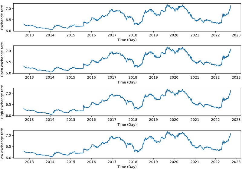
(2) Vertically Stacked Subplots
We can easily stack two or more subplots vertically by defining only the number of rows. For example, stack 4 subplots vertically as follows.
(i) Axes pack method
We can pack the axes as(axes1, axes2, …) or (ax1, ax2, …), or any names you like, and then unpack them during the subplots.
fig, (ax1, ax2,ax3,ax4) = plt.subplots(4,figsize=(10, 7))

ax1.plot(x,y1);
ax1.set_ylabel("Exchange rate");
ax1.set_xlabel("Time (Day)")

ax2.plot(x,y2);
ax2.set_ylabel("Open exchange rate");
ax2.set_xlabel("Time (Day)")

ax3.plot(x,y3);
ax3.set_ylabel("High Exchange rate");
ax3.set_xlabel("Time (Day)")

ax4.plot(x,y4);
ax4.set_ylabel("Low exchange rate");
ax4.set_xlabel("Time (Day)")

plt.tight_layout()
If we create just a few Axes, it’s handy to unpack them immediately to dedicated variables for each Axes. If there are many Axes, we can use just use axs[indexNumber] for the subplots, which I called it axes index method.
(ii) Axes index method
fig, axs = plt.subplots(4,figsize=(10, 7))

axs[0].plot(x,y1);
axs[0].set_ylabel("Exchange rate");
axs[0].set_xlabel("Time (Day)")

axs[1].plot(x,y2);
axs[1].set_ylabel("Open exchange rate");
axs[1].set_xlabel("Time (Day)")

axs[2].plot(x,y3);
axs[2].set_ylabel("High Exchange rate");
axs[2].set_xlabel("Time (Day)")

axs[3].plot(x,y4);
axs[3].set_ylabel("Low exchange rate");
axs[3].set_xlabel("Time (Day)")

plt.tight_layout()

plt.show()
We get the same output as the first method.
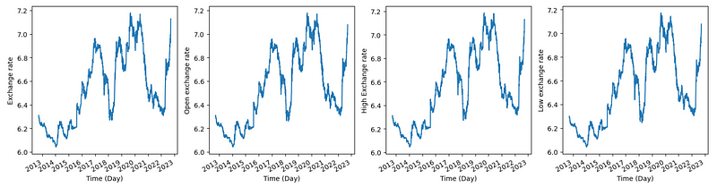
(3) Horizontally stacked subplots
The above two methods can also be used to easily stack two or more subplots horizontally by defining the number of columns and rows. Let’s stack 4 subplots horizontally in the following example using the first method above. To obtain side-by-side subplots, pass parameters 1, 4 for 1 row and 4 columns.
fig, (ax1, ax2,ax3,ax4) = plt.subplots(1,4,figsize=(15, 4))

#rotat and fix problem of crowded x-labels
fig.autofmt_xdate()

ax1.plot(x,y1);
ax1.set_ylabel("Exchange rate");
ax1.set_xlabel("Time (Day)")

ax2.plot(x,y2);
ax2.set_ylabel("Open exchange rate");
ax2.set_xlabel("Time (Day)")

ax3.plot(x,y3);
ax3.set_ylabel("High Exchange rate");
ax3.set_xlabel("Time (Day)")

ax4.plot(x,y4);
ax4.set_ylabel("Low exchange rate");
ax4.set_xlabel("Time (Day)")

plt.tight_layout()
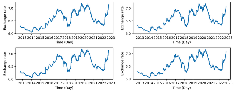
(4) Bidirectional stacked subplots
When stacking in two directions, the returned axs is a 2D NumPy array. If you have to set parameters for each subplot, it’s handy to iterate over all subplots in a 2D grid using for ax.
fig, axs = plt.subplots(2,2,figsize=(10, 4))

axs[0,0].plot(x,y1);
axs[0,0].set_ylabel("Exchange rate");
axs[0,0].set_xlabel("Time (Day)")

axs[0,1].plot(x,y2);
axs[0,1].set_ylabel("Exchange rate");
axs[0,1].set_xlabel("Time (Day)")

axs[1,0].plot(x,y3);
axs[1,0].set_ylabel("Exchange rate");
axs[1,0].set_xlabel("Time (Day)")

axs[1,1].plot(x,y4);
axs[1,1].set_ylabel("Exchange rate");
axs[1,1].set_xlabel("Time (Day)")

plt.tight_layout()
4. Online Course
If you are interested in learning Python data analysis in details, you are welcome to enroll one of my course:
Master Python Data Analysis and Modelling Essentials