To rotate axis tick labels is an excellent way to solve the unreadable problem due to the overlapped labels
In the previous 3 posts, essentials of data visualization with Matplotlib have been discussed. If you are interested in those posts, you can start to read from this article. Otherwise, just go ahead to read this article.
We usually need to rotate x-axis or y-axis tick labels because the plots sometimes contain time/dates. Time data is often long, which causes overlapping and unreadable problems, especially the plot is small and several plots on the same rows.
In this article, I will display some convenient methods to rotate axis labels with a real-world data, which is a USD to CNY exchange daily rate dataset during September 24, 2012 to September 24, 2023. You might have the dataset if you read my previous posts. Never mind, for your convenience, I have downloaded this dataset and put it in my GitHub repository. You can download it by clicking this link. If you use this dataset for other things more than personal study, please cite the dataset source: ca.investing.com, where I downloaded the dataset.
1. Read the Dataset
Let’s read the dataset first. You can download the dataset using the above-mentioned link to download the dataset and read it from your local working directory, while we will read it from my GitHub repository directory. You can read this post of mine to understand the process on how to read dataset from GitHub in details.
# import required libraries
import pandas as pd
import matplotlib.pyplot as plt

# read the dataset from my github repository
url = 'https://raw.githubusercontent.com/shoukewei/data/main/data-wpt/USD_CNY%20Historical%20Data.csv'
df = pd.read_csv(url)

# display the first 5 rows
df.head()

1. plt.xticks() method
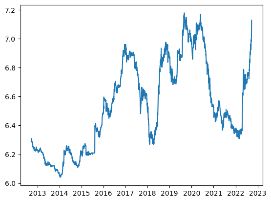
Here, We just plot a simple figure on the Price, for example, to display the method.
In this example, we will use the real Date column as the x-axis rather than the index number. In this dataset, the Date column is a Series object (see this previous post), so we should transfer it to pandas datetime object.
df["Date"] = pd.to_datetime(df["Date"])

plt.plot(df["Date"],df['Price'])
plt.show()

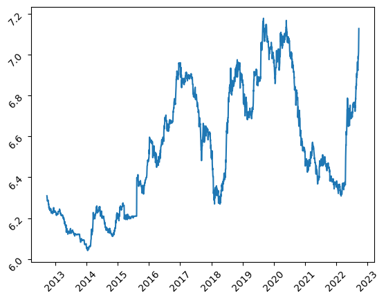
Next, let’s rotate both x-axis and y-axis ticks by 45-degrees by just adding plt.xticks(rotation = degree) and plt.yticks(rotation = degree).
# create the plot
plt.plot(df["Date"],df['Price'])

# rotate axis ticks
plt.xticks(rotation = 45)
plt.yticks(rotation = 45)

plt.show()

2. ax.tick_params() method
This method use ax.tick_params(axis=’x or y’, labelrotation = degree) to rotate x-axis or y-axis. Let’s see an example.
plt.plot(df["Date"],df['Price'])

# get the current Axes object
ax = plt.gca()

# rotate axis ticks
ax.tick_params(axis='x', labelrotation = 45)
ax.tick_params(axis='y', labelrotation = 45)

plt.show()

This method is especially suitable for plt.subplots method or plot with the Object-oriented Interface. Let’s see the following example.
fig, ax = plt.subplots()

ax.plot(df['Date'],df['Price'])

ax.tick_params(axis='x', labelrotation = 45)
ax.tick_params(axis='y', labelrotation = 45)

plt.show()

3. fig.autofmt_xdate() method
This method is much easier than previous ones, where fig.autofmt_xdate() and fig.autofmt_ydate() are used to rotate x-axis ticks and y-axis ticks, respectively. This method is very suitable for multiple subplots to solve the overlapping problem of tick labels.
Actually, this method has been used once in a previous post. Here, we plot 4 figures horizontally.
x = df['Date']
y1 = df['Price']
y2 = df['Open']
y3 = df['High']
y4 = df['Low']
fig, (ax1, ax2,ax3,ax4) = plt.subplots(1,4,figsize=(15, 4))

ax1.plot(x,y1);
ax1.set_ylabel("Exchange rate");
ax1.set_xlabel("Time (Day)")

ax2.plot(x,y2);
ax2.set_ylabel("Open exchange rate");
ax2.set_xlabel("Time (Day)")

ax3.plot(x,y3);
ax3.set_ylabel("High Exchange rate");
ax3.set_xlabel("Time (Day)")

ax4.plot(x,y4);
ax4.set_ylabel("Low exchange rate");
ax4.set_xlabel("Time (Day)")

plt.tight_layout()

plt.show()

Let’s use fig.autofmt_xdate() to rotate and fix the overlapping problem x-labels, which can be put before the plot or after the end.
fig, (ax1, ax2,ax3,ax4) = plt.subplots(1,4,figsize=(15, 4))

#rotat and fix the overlapping problem x-labels
fig.autofmt_xdate()

ax1.plot(x,y1);
ax1.set_ylabel("Exchange rate");
ax1.set_xlabel("Time (Day)")

ax2.plot(x,y2);
ax2.set_ylabel("Open exchange rate");
ax2.set_xlabel("Time (Day)")

ax3.plot(x,y3);
ax3.set_ylabel("High Exchange rate");
ax3.set_xlabel("Time (Day)")

ax4.plot(x,y4);
ax4.set_ylabel("Low exchange rate");
ax4.set_xlabel("Time (Day)")

# or put here

plt.tight_layout()

plt.show()

Besides, there is still another widely used method, ax.set_xticklabels(). Whereas, it is a little bit complicated for time/data axis, thus I do not suggest using it.
4. Online Course
If you are interested in learning Python data analysis in details, you are welcome to enroll one of my courses:
Master Python Data Analysis and Modelling Essentials


